
Monday, December 12, 2016
Wednesday, October 26, 2016
Small Reference Source.......
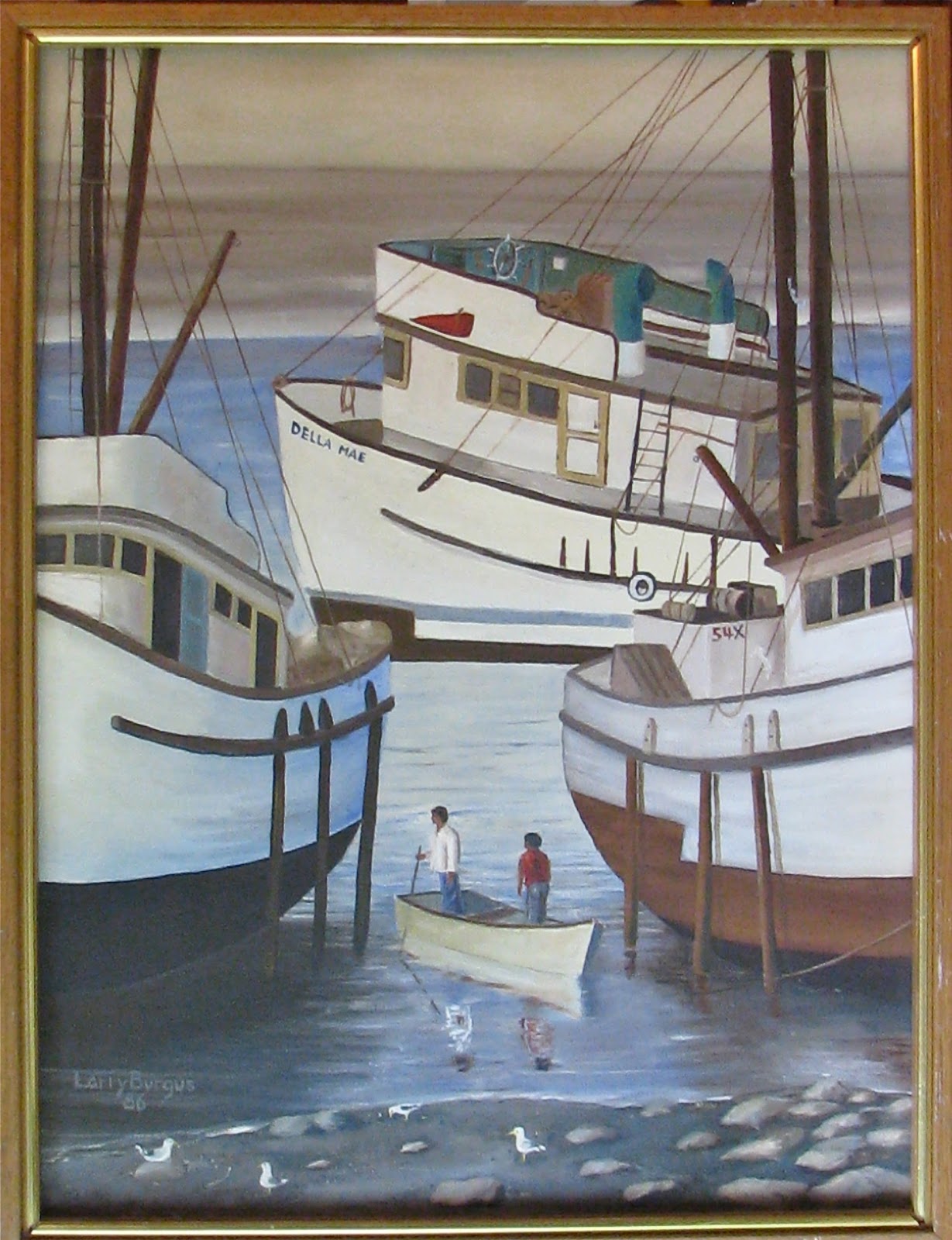

When I was starting out to paint in my early years I would find the oddest things to inspire me. This was a small photograph in a National Geographic Magazine. I really liked the composition with the three boats moored while the tide was out. The two guys in the photo and the seagulls helped to show the size of the fishing boats in the scene in comparison. The whole scene was a great photograph taken by a magazine contributor.
I did try to duplicate all of the colors with the water and shoreline of rocks and clay. I bet I could paint better seagulls now than back when I did this painting. I liked seeing the poles that helped to stay the boats and all the rigging was fun to portray. I did name the one boat after my wife.
Tuesday, October 18, 2016
Two Geese......

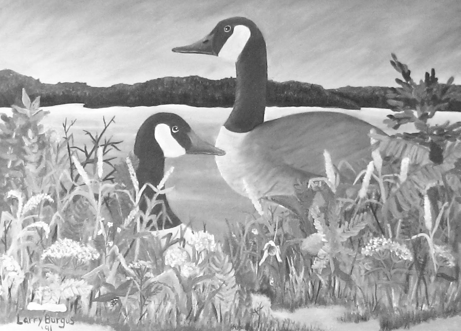
This was painted a long time ago when I was young. I really am not a wildlife painter but I took a stab at it. I really did get into the real and not so real foliage. I a not sure if I was doing real things but at the time I probably thought that I was. The black and white shown below the colored painting has no purpose other than to show the value contrast in the painting.
The Minnesota shoreline of some lake is pretty much authentic looking as I have painted many times the shores of the lakes in the state. The sky also seems to be one that I have studied for many different kinds of paintings. I think I have done more watercolor paintings as well as pastel paintings creating this same sky.
Artists sometimes says that they will return to a painting but it really is not a good idea.. Maybe a newer pose of some Canada geese on the water would be worth a try instead.
Monday, September 19, 2016
Southwest Theme........

A painting that I created many years ago was done in oil paint. I had found the photo of this church in a New Mexico magazine. The photo in the magazine was a small one and it didn't stop me from trying to capture the feeling of the building. The stucco walls and the roof construction really fascinated me and the decorated carved doors accented this building. The one modern window above the door seems to be contradictory to the style of everything but utilitarian practices usually win out when you need to replace a window.. Playing with the light on the building and adding stones and greens gave the painting better color balance. One could never know if the sun is rising or if it is setting. The shadows are so great to add the dimensional qualities to bring it closer to realism. The photo quality is bad on the right side of the painting as there is not white areas in the sky of the real work.
Tuesday, September 13, 2016
Early Oil Painting

As I started to paint in oil I would find small pictures in travel magazines to copy. This photo probably was a 2 inch by 3 inch photo. I picked it because of its colors and also the French church that was in the photo. Oil paint allows an artist to blend colors so uniquely having gradual value and color changes. I see that I did this back in 1987 when I had started to paint many things during my summer break.
Monday, August 22, 2016
My Early Work.......C.Y Stephens

While attending Iowa State University I took one of the painting courses offered. The course was one that required much discipline to accomplish a number of paintings in a very short period of time. I really was not an experienced artist and was in college to learn the skills of teaching and the art mediums. During the painting class I produced many different kinds of painting as I really didn't have any established style of painting. I was very inexperienced.

The black and white version of the painting gives you a feeling of what I had for references as I mixed the paints to make the values of color for the painting. My instructor did not give directions or opinions about the students work but this one she felt that I had perfected a great work of art.
I was 20 years old then and fresh out of a small town high school. It amazes me to this day that I could figure it out as best that I did to get the colors working in the composition. It was trial and error being a major part of the job. I am sure some of those squares have been painted many layers before I got the right colors to work. At the time this was a popular way of doing paintings fitting into the Pop Art world in some way. I remember specifically a person drawing out the side view of a threshing machine into shapes and painting it in a similar color scheme.
Forty some years later the painting is in good shape. The varnish that we were taught to apply with a brush has yellowed in places. I am sure there is a process to remove it and replace it with a thin spray of varnish. The modern paining hangs at the top of the stairs in our house and it has always fit into our everyday life.
Saturday, June 11, 2016
Painting in my Past.......

We were at a motel along Lake Superior 15 years or more ago. It was north of Grand Marais. Minnesota. Directly behind the motel sat this building. It was sitting so close to the motel that driving was tight in order to park the car. It was being used for storage for the maintenance of the business I photographed the building as the character was so good. I had to take shots of it in parts as I could stand far enough away from it to get it all in one photo. Later that summer I recreated it in this scene. The old truck was a photo I had found in a newspaper and the barn comes from my experiences of being on farms as a farm boy. The goats and hollyhocks helped add to the finished painting for sure.
I sold the painting 10 years ago and I just now found in an image file probably the only image of the painting. I was glad to find it. Artists do get attached to some of there work and this one was one of my favorites. I am glad that I can share this one with you today.
Friday, February 19, 2016
ACEO Cards.......

I am not a part of the group that trades artist trading cards. I just thought it would be fun to try my hand at it. ACEO cards are small artworks created by artist in many different mediums. They can be designs, portraits, landscapes and I guess abstracts. The official size is suppose to be 2 and 1/2 inches by 3 and 1/2 inches.

My latest creation was done while I was observing and assisting a high school art class. It is a challenge to just start off and blindly create. I like to react to what I have put on the paper and then add to enhance the composition.

This is an older one that I had done last year. I really don't know where my ideas are coming from but sometimes the space theme invades my designs.

I find when I have free time that it is good to keep using the skills moving, even when the artwork is so small.
Wednesday, February 10, 2016
Crafty Painting.......

A few years back I would be working on a work and find some down time when I wasn't working. I would paint on things. The rocks are fun to paint on with acrylic paint. The piece of walnut wood took a while to get the paint to self seal itself on the wood. Once I had enough coats of acrylic paint the bottom layers dried into the wood and sealed the porous walnut wood.

The colors are not quite correct here but I wanted you to see closer the natural wood texture that is at the top of the walnut slab of wood.


This one is a little weathered from laying in the kitchen window ledge. It took on moisture. It makes it look like it has been antiqued.
Subscribe to:
Posts (Atom)